8 minute read · Ultimo Research Desk · Reviewed 5 Sept 2026
Standard Deviation and Historical Volatility: What They Measure and When They Lie
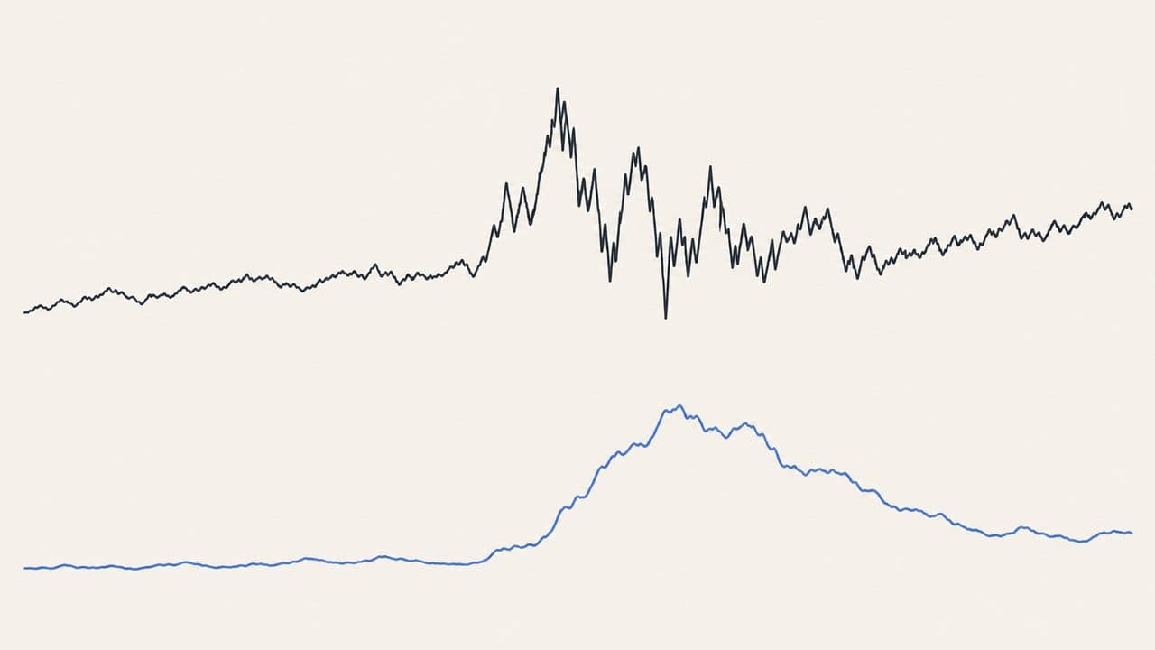
Historical volatility is the standard deviation of the instrument's recent returns — how widely they have been scattered around their average — usually multiplied by the square root of 252 so that a daily figure can be quoted as "annualised". It is the most honest number in technical analysis because it claims nothing: it describes the past sample and stops.
It lies only when someone makes it forecast. A twenty-day window that happened to be quiet says the last twenty days were quiet. Volatility clusters, so quiet tends to follow quiet, but the exceptions are exactly the days that matter, and after a shock the number stays high for the whole window while the market has long since calmed.
What it measures
Standard deviation is a statistic, not an indicator; nobody invented it for charts. Applied to returns it becomes a volatility estimate, and every choice along the way changes the answer: simple or log returns; population (÷ n) or sample (÷ n − 1) denominator; close-to-close, which ignores everything inside the bar, or a range-based estimator like Parkinson's (1980), which uses the highs and lows. "Historical volatility" on a platform is a label, not a definition.
Twenty and thirty periods are the common windows. Short windows react fast and are noisy; long ones are steady and stale.
The formula, in words
- Returns: today's close ÷ yesterday's close − 1 (or the natural log of the ratio).
- Mean of the last n returns.
- Each return minus the mean, squared. Add them up.
- Divide by n (population) or n − 1 (sample). Square root. That is the per-period volatility.
- Annualise, if wanted: multiply by √(periods per year) — √252 for daily data. Never annualise a number twice.
A rolling window is a simple average, not an EMA; exponentially weighted volatility (EWMA, RiskMetrics) is a different model.
Worked example
Three returns: +2%, −1%, +1%. Mean 0.667%. Deviations 1.333, −1.667, 0.333. Squared: 1.778, 2.778, 0.111; sum 4.667.
Population: 4.667 ÷ 3 = 1.556; √ = 1.247% per period. Annualised: 1.247 × 15.87 = 19.8%.
Sample: 4.667 ÷ 2 = 2.333; √ = 1.528%, annualised 24.2%. Same three returns, a fifth more volatility, purely from the denominator. That is why the number on your platform and the number in a research note rarely match.
How it is read
Higher means the recent sample was more scattered. Lower means quieter. Rising means the estimate is increasing as new returns enter and old ones leave — which can happen because today was wild, or because a calm day from n days ago just dropped out. Comparing two instruments needs the same return definition, interval and annualisation; comparing a daily figure with a weekly one is meaningless.
Volatility is a component of risk, not the whole of it. A low-volatility instrument can still gap, still go illiquid, and still default. The Eurobond guides are about instruments whose daily volatility understates the risk badly.
When they lie
Treating the window as the future. A shock that inflates the number for twenty days after one bad day. Adjusted versus unadjusted prices, session boundaries, missing bars. Close-to-close data on an instrument whose real movement happens inside the bar. Fitting the window to the sample you wanted to describe. And the quiet mechanical error: annualising with 365 instead of 252, or annualising hourly data with a daily factor.
What they do not tell you
Direction. The probability of any particular move — that needs a distribution, and returns do not reliably follow a normal one. The cause of a shock. The maximum loss, which volatility bounds only in the theory that fails on the days you need it.
What the evidence actually says
The same three papers apply to every indicator in this series, so the short version: Brock, Lakonishok and LeBaron (1992) found simple moving-average and trading-range rules carried information on ninety years of the Dow; Sullivan, Timmermann and White (1999) showed that once you count how many rules were tried, the best of them stops being significant — the data-snooping result; Park and Irwin (2007) reviewed ninety-five later studies and found roughly half positive, a quarter negative, and most of the positives shrinking after costs. The RSI guide has the longer version.
Parkinson (1980) showed that the high–low range estimates variance more efficiently than closes alone, under assumptions. That is a result about measuring volatility, not about predicting anything, and it is the kind of result this whole area produces: better rulers, no forecasts.
Where it fits
Volatility as a number is not a vote on our signal pages, but it is the quantity behind three guides: ATR is volatility in price units, Bollinger Bands are volatility drawn around a mean, and Keltner Channels are ATR drawn the same way. Understand this one and the other three are bookkeeping.
A note on risk: a low reading is a description of a calm month. Size the position for the month it did not measure.
Sources
- Parkinson (1980), "The Extreme Value Method for Estimating the Variance of the Rate of Return", Journal of Business: DOI
- Brock, Lakonishok and LeBaron (1992): DOI
- Sullivan, Timmermann and White (1999): DOI
- Lo, Mamaysky and Wang (2000): DOI
- Park and Irwin (2007): DOI
- Menkhoff and Taylor (2007): DOI
- Murphy, John J., Technical Analysis of the Financial Markets (1999): Google Books
Written by the Ultimo Research Desk and checked against our own contract specifications and client agreement before publication; reviewed again when those change. Educational only — nothing here is a recommendation to trade. Spotted an error? Tell us.